Visualization Techniques and Practice
16.3K views | +0 today
Follow
Visualization Techniques and Practice
How to use visualization techniques for nonprofits in areas like data analysis, learning, facilitation, and innovation
Curated by Beth Kanter
Your new post is loading...
Rescooped by Beth Kanter from visual data
Scoop.it!

An infographic explores the state of infographics

An infographic explores the state of infographics | Visualization Techniques and Practice | Scoop.it

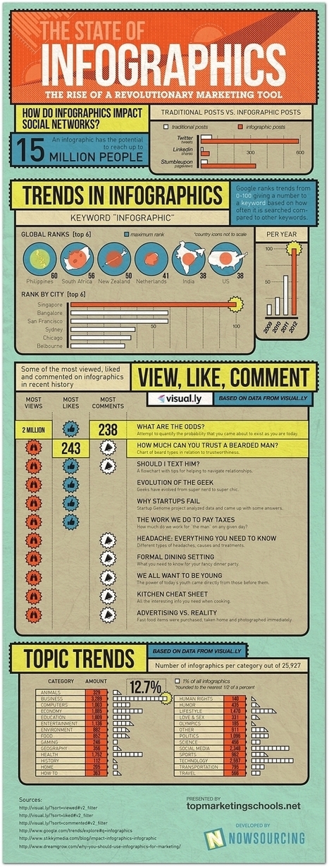
It turns out 2012 was a huge year for the infographic—internet culture likes its data presented with charming representative imagery. 


Business, technology, and social media comprised the most popular topics for this exploding medium, according to data, Singapore searched the term “infographic” more than any other global city. 
The year’s most popular infographic was “What Are the Odds,” which explores how improbable it is that you (or this infographic, for that matter) came into existence in the first place...


Via Lauren Moss
No comment yet.
Rescooped by Beth Kanter from visual data
Scoop.it!

The 16 Most Compelling Infographics Of 2012

The 16 Most Compelling Infographics Of 2012 | Visualization Techniques and Practice | Scoop.it

2012 might be the year which we reached 'peak infographic'.

You can’t have an issue or a piece of data without putting it into a picture so it’s easier for people to understand. While this has mostly resulted in a glut of ugly graphics that don’t actually do anything with data (and you’ll see some of these below), it’s still an incredibly simple way to get information to you fast. And this year, some of our most compelling content has appeared in the format.

These are some of our favorites.


Via Lauren Moss
Lauren Moss's curator insight, December 21, 2012 5:40 PM

A curated infographic gallery from FastCompany...

Jean-Michel Bayle's curator insight, December 29, 2012 11:49 AM

A voir ... rapidement